I recently got two Non Metallic Metal Paint sets for my birthday. It is a painting technique that I have never really tried, painting a metallic surface using solid non metallic colours by simulating the reflections of the metallic surface. It does look good when painted well, but looks off if painted poorly. This is my first real attempt at the technique and I thought I would post my thoughts on the two sets as I use them. Sounds like a review, but that implies I know what I’m talking about. No, this is more of a reflection of the NMM paint sets by an inquisitive hobbyist. Oh come on, you must have seen that pun coming at some point!
Why did i pick these two sets?
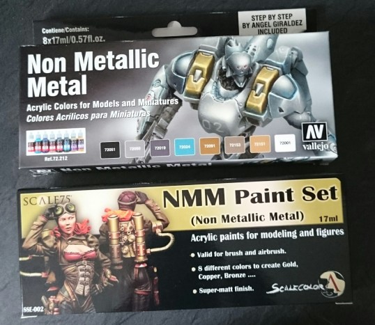
First of all I’m familiar with Vallejo paints, they are in amongst my collection of regularly used paints. The guide that comes in the Vallejo set was written by Ángel Giráldez. He wrote a painting guide I own, “Painting Miniatures from A to Z, Ángel Giráldez Masterclass Volume 1”, I have enjoyed using this book and found it easy to understand. It has greatly improved my painting, especially with an airbrush. Check out any of my Panoceania Infinity models as they have been painted with the aid of this book. You’ll see a real improvement from the first few models to the latter painted models.
Scale 75 seem to be the new kid on the block, although I’m sure they have been around for years. Its good to try new things, I’ve seen them reviewed in a few places. I found the most informative review for me was this one by Deno. It highlighted some things to me that may mean that I end up not liking the paint. But the attraction is the matt pastel colours. I have a painting project I’m planning where I envisage that that trait would be beneficial. So this is a test bed for that too.
What’s in the Scale 75 box?
Scale 75 NMM Gold & Copper set SSE-002 contents:
There are 8 paints in the box, although no websites (that I’ve seen) list directly on their information page what paints are in the set. You have to squint at the images on the website, even Scale 75’s own website. So here is the list of the contents:
- SC-09 White Sands (individual pot link)
- SC-10 Tenere Yellow (individual pot link)
- SC-11 Sahara Yellow (individual pot link)
- SC-12 Gobi Brown (individual pot link)
- SC-13 Dubai Brown (individual pot link)
- SC-14 Kalahari Orange (individual pot link)
- SC-15 Adriatic Blue (individual pot link)
- SC-16 Eclipse Grey (individual pot link)
- A single sided leaflet about A5 in size describing a method of painting Gold and Copper using the included paints.

Much lower resolution copy of the Scale 75 image available at their download site
Handily I stumbled across the leaflet on the Scale 75 downloads site, when I was trying to find out what paints were in the set. That link has all their other sets too. Go check it out if you’re considering buying a Scale 75 set.
Overall the set offers a discount when compared to buying the paints individually of about 12% depending on the retailer’s prices. Not bad if you think you’ll use all the colours.
Painting with Scale 75
I normally paint from a black undercoat, which is then further give a light spray of brown primer.
The Masons models were just primed black. To avoid issues with painting light colours that have difficulty covering black effectively I base coat the area with an intermediate colour, usually brown.
The first step of the guide says to give the area to be painted gold a coat of Gobi Brown mixed with Sahara Yellow. That mix didn’t cover the black at all well. So I then used just Gobi Brown, this also struggled to cover the black undercoat. This surprised me, as its similar to the intermediate colour I’d pick normally to base coat over the black.
At this point instead of wasting time struggling to cover the black undercoat, I quickly airbrushed some grey primer over the model, covering previous work in the process.
So first observation, the colours I’m using do not cover a black undercoat. Of course now I know this, I also noticed that the guide appears to show white primed example model.
I am having difficulty blending the colours. In the images below you can see that some of the transitions just aren’t there (if it’s possible to see something that’s not there lol). I have a very stark change in colour with no gradient. I’m not the best at blending. I am very lazy with blending really, so I believe it is my technique more than the paint. However I had difficulty getting anything approaching a smooth blend, which I normally would be able to achieve using Vallejo or P3 paints. I actually found trying to blend with Scale 75 with my ‘lazy blending technique’ very frustrating. I’d paint what I thought would be a nice transition, only for it to dry more opaque than expected, and lose the gradient I thought was there.
Scale 75 definitely have a very matt finish. My painting in the images below looks like the paint has a chalky finish but the actual surface is smoother than it looks in my awful mobile phone pics. The quickly airbrushed grey didn’t help matters in that regard.
So after what I’m currently considering an unsatisfactory result I had a play with the Vallejo set.
What’s in the Vallejo box?
Vallejo Game Colour Set Non Metallic Metal 72.212 contents:
The contents of the Vallejo set is easily available on the internet and I’ll just add it below just for completeness. It contains 8 paints however this time the colours are aimed at Steel and Gold.
- 72.051 Black (individual pot link)
- 72.050 Cold Grey (individual pot link)
- 72.019 Night Blue (individual pot link)
- 72.024 Falcon Turquoise (individual pot link)
- 72.091 Sepia (individual pot link)
- 72.153 Heavy Brown (individual pot link)
- 72.151 Heavy Gold Brown (individual pot link)
- 72.001 Dead White (individual pot link)
- A leaflet describing how to paint NMM Steel and NMM Gold, along with a little summary of basic painting techniques.

A brief glimpse of the Vallejo guide.
The leaflet is written with a similar number of steps for each colour as the Scale 75 guide. This leaflet is written in a similar style to the book Ángel wrote, however the guide just seems a little lacking in comparison to the book. For example, in the book there is a little airbrush and paintbrush symbol to tell you how the paint is being applied to the model. I guess there is more space in a book in comparison to a leaflet. Overall I do think it is a better guide than the Scale 75 guide, even though the actual descriptive text for each individual step is similar. I can’t find a link for a downloadable version of the leaflet on the Vallejo site so you’ll have to buy the set to see it.
Again buying the set is better value for money than buying the paints individually, but the saving is much smaller for this set.
Painting with Vallejo
Having corrected the black primer mistake for all the Mason models at the same time, I never actually tested the Vallejo over a black undercoat. However the guide included with the set looks like the model was initially undercoated black. The set includes some Extra Opaque Game Colour paints, I believe these are designed specifically for covering black primer. So I suspect there would be little problem in using the set over a black primer.
I mentioned earlier that I have a number of Vallejo paints already, although not any colours that came in this set. I have found that they behave in a manner that I am used to, so didn’t have any issues applying the paint and achieving what I expected to achieve. (I’m still lazy, and my blending does need work.) As I didn’t end up feeling frustrated I enjoyed painting with this set more.
Not very descriptive?
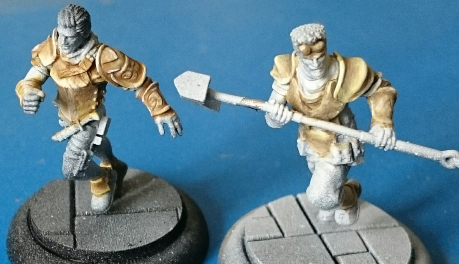
I’ve tried writing the two painting sections above a few times now. Each time I have utterly failed to describe how I have found using the paints. I also tried to describe what I mean by lazy blending, again failing. I’ll work on that for the next post. I have more respect for people who are able to write guides about painting now lol. But in the meantime here are some side by side comparisons of the two paint sets. They say a picture speaks a thousand words, in this case I hope so. Left hand model, Flint, painted using the Vallejo set. Right hand model, Mallet, is painted using the Scale 75 set.
Clicking on the image should open a much higher resolution image, so you can be appalled at my first NMM Gold attempts 😉


Initial Thoughts
This really isn’t a conclusion, not by a long shot. I’ve just starting playing with these paints, and I have a long way to go before I achieve something I am happy to call NMM Gold. Regardless of which paint I use I still have a lot to learn about the placement of the “simulated reflections” I keep blathering on about.
Although it sounds like i have been quite negative about the Scale 75 paint I am not writing them off yet. Not by a long shot. They are giving me the pastel look that I want to bare in mind for something else (a project that, knowing me, will never get past the buying models stage). I’m not yet used to the paint which sounds daft but is true, and I’ve felt like this before but in a completely different circumstances. Kayak analogy coming up – a few years ago I bought a new kayak, it was a completely different style and design to the one I’d used for years. However the first few rivers I paddled in it I didn’t enjoy it, I felt less comfortable and less confident in the new boat compared to my old boat, even doing simple things on the water. I just had to give it time and learn how my new boat behaved before I could really enjoy it.
Next up, I’ll try and get the above models blocked in with the remaining colours. To get a better feel for how the model will look over all. Right now I think both models could use a glaze on the NMM, with something like a chestnut ink. I hope that will bring the colours and transitions back together and cure some of the issues I’ve got with these two model’s paint jobs. Since all the above has been done with a traditional brush, I might use the airbrush and see what a difference that makes.
I’ve got a full Masons team to paint, so plenty more to practice on. I need to add depth to the shadows particularly the Scale 75, but I think the Vallejo models will benefit from this too. Regardless of which paint I use I need to work on the positioning of the contrast of the colours and the painted reflections that make NMM work.

Interesting read! Both look pretty good, very different styles really. I think at the moment I prefer the Vallejo look more, probably based of the fact that it has more contrast.
The Vallejo is my favourite of the two too. There is an element of practice/learning curve in there as well as it was the second one painted
Pingback: Joe “Scarface” Turner | Splayed Paint Brush